 By Charlotte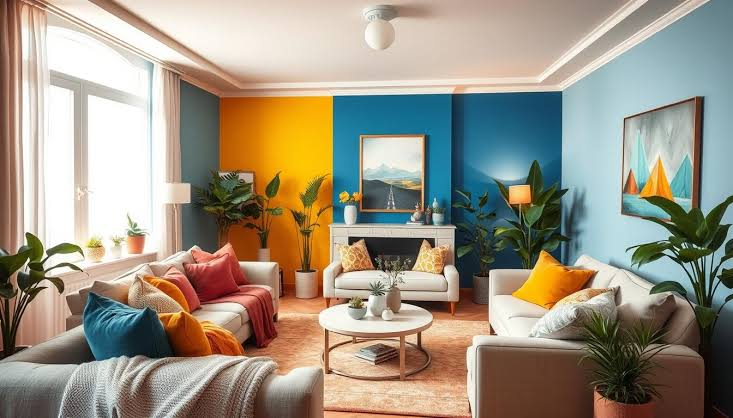
Color is one of the most powerful design tools in any home, yet it is often chosen based on trends or personal preference alone. In reality, room colors have a deep psychological impact that influences mood, behavior, productivity, relaxation, and overall daily comfort. The colors surrounding you every day shape how you feel in your own space more than most people realize.
From calming blues in bedrooms to energizing yellows in kitchens, each shade sends subtle signals to the brain that affect emotional responses. Understanding the psychology behind room colors can help you create a home that not only looks beautiful but also supports mental well-being and functional living.
This guide explores how different colors influence emotions, how they affect various rooms in the home, and how to use them effectively for comfort and balance.
Human beings respond instinctively to color because it is processed in the brain’s visual and emotional centers simultaneously. When light reflects off colored surfaces, it triggers associations formed through both nature and cultural experience.
For example, blue is often associated with the sky and ocean, creating a natural sense of calm. Red is linked to fire and warmth, which increases alertness and energy. These associations influence emotional reactions even when people are not consciously aware of them.
Over time, the colors in a home environment can shape daily behavior patterns. A calming environment may reduce stress levels, while overly stimulating colors may increase anxiety or restlessness.
Blue is one of the most widely used colors in interior design because of its calming psychological effects. It slows heart rate, reduces stress, and promotes mental clarity. This makes it ideal for bedrooms, study rooms, and relaxation areas.
Light blue tones create openness and tranquility, making small rooms feel larger and more peaceful. Dark blue tones, on the other hand, add depth and sophistication but should be balanced with lighter elements to avoid a cold or overly serious atmosphere.
In daily home living, blue helps create a stable emotional environment, especially in spaces where rest and focus are important.
Red is a strong, emotionally intense color that increases energy levels and stimulates the senses. It is often associated with passion, warmth, and excitement.
In home environments, red is commonly used in dining areas because it can stimulate appetite and encourage social interaction. However, excessive use of red can create feelings of tension or agitation, especially in bedrooms or relaxation spaces.
When used correctly, red works best as an accent color in cushions, décor pieces, or feature walls rather than a dominant room color.
Green is psychologically one of the most balanced colors because it sits in the middle of the visible spectrum. It is strongly associated with nature, growth, and renewal, which creates a soothing effect on the mind.
Green reduces eye strain and mental fatigue, making it ideal for living rooms, reading corners, and home offices. It also promotes a sense of emotional stability and harmony.
Soft green shades work particularly well in daily living spaces because they support both relaxation and productivity without overwhelming the senses.
Yellow is a bright and uplifting color associated with happiness, creativity, and warmth. It is often used in kitchens and breakfast areas because it creates a cheerful atmosphere and encourages activity.
Soft yellow tones can make a room feel more inviting and spacious. However, overly bright or intense yellow can lead to visual fatigue or anxiety if used excessively.
In home environments, yellow works best in moderation or as an accent color that adds warmth and positivity without overwhelming the space.
White is a timeless color in interior design, especially in minimalist and modern homes. It represents cleanliness, simplicity, and openness.
White walls and furniture make spaces appear larger and brighter, which is especially useful in small homes. It also provides a neutral background that allows other design elements to stand out.
However, too much white without texture or contrast can feel sterile or emotionally flat. Adding natural materials like wood or soft textiles helps balance its visual impact.
Gray is a versatile and modern color that creates a sense of calm neutrality. It is widely used in contemporary interiors because it pairs well with almost any other color.
Light gray creates a soft and peaceful environment, while darker shades add elegance and depth. Gray helps reduce visual clutter and promotes a balanced emotional tone in a room.
However, excessive gray without warm accents can feel dull or uninspiring, so it is important to pair it with textures or complementary colors.
Room colors influence how people experience comfort in their homes on a daily basis. They affect sleep quality, focus levels, emotional stability, and even social behavior.
Bedrooms painted in calming tones such as blue or soft green promote better sleep and relaxation. Living rooms benefit from balanced colors that support both social interaction and rest. Kitchens often use warm colors like yellow or red tones to encourage energy and activity.
Home offices require colors that enhance concentration without causing mental fatigue. Green and light blue are often preferred because they maintain focus while reducing stress.
Even small color changes, such as accent walls or décor updates, can significantly improve emotional comfort and overall home experience.
Using a single color throughout a space can sometimes feel limiting. Combining colors thoughtfully creates emotional balance and visual interest.
Combining warm colors like beige or soft yellow with cool colors like blue or green creates harmony and prevents emotional extremes. This balance supports both relaxation and energy depending on the space.
Neutral backgrounds such as white, gray, or beige allow accent colors to stand out without overwhelming the room. This approach is commonly used in modern minimalist interiors.
Using variations of a single color creates a cohesive and calming environment. This approach is especially effective in bedrooms and meditation spaces.
Lighting significantly affects how colors are perceived in a room. The same paint color can look completely different under various lighting conditions.
Natural light enhances true color tones and improves visual clarity. Warm artificial lighting softens colors and creates a cozy atmosphere, while cool lighting enhances focus and brightness.
Because of this, selecting room colors should always consider lighting conditions throughout the day.
Many homeowners make avoidable mistakes when selecting colors for their living spaces. One of the most common is choosing colors purely based on trends rather than emotional impact.
Another mistake is using overly bold colors in small rooms, which can make spaces feel cramped and visually overwhelming. Lack of consistency between rooms can also disrupt flow and reduce overall harmony in the home.
Ignoring lighting conditions is another frequent issue that leads to unexpected color results after painting or decorating.
Soft blue, light green, and neutral beige are considered the most relaxing colors because they reduce stress and promote calmness.
Yes, room colors influence mood and behavior by triggering psychological and emotional responses in the brain.
Green and light blue are ideal for productivity because they support focus while reducing mental fatigue.
Yes, dark colors can make a room feel smaller and more enclosed, especially in spaces with limited lighting.
Neutral colors like white, beige, and light gray are the safest choices because they are versatile and emotionally balanced.
The psychological impact of room colors is a powerful factor in shaping daily home living comfort. Colors influence mood, energy, focus, and relaxation in subtle but meaningful ways. By understanding how different shades affect the mind, homeowners can design spaces that truly support their lifestyle and emotional well-being.
A thoughtfully chosen color palette does more than decorate a home—it improves how you feel every single day. Whether you prefer calming tones, energetic accents, or balanced neutrals, the right color choices can transform your living environment into a more comfortable, harmonious, and emotionally supportive space.
 Galileo