 By Charlotte
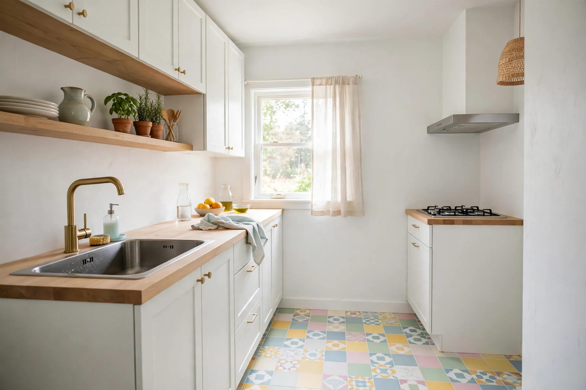
A small kitchen does not need more square metres to feel larger, it needs fewer visual interruptions, more reflected light, and a floor that does not chop the room into pieces. Floor colour is one of the fastest ways to change how a kitchen feels, because the floor is the largest continuous surface in the room, and the eye reads it before it reads cabinets, worktops, or appliances.
The short answer is that light, warm-neutral colours — pale oak, whitewashed wood, soft white, sandy beige, and light grey — make a small kitchen feel brighter and larger, especially when they are laid in large-format tiles or wide planks with low-contrast grout or joints, and continued into an adjoining room without a threshold strip. Dark, busy, or high-contrast floors can look rich in a large kitchen, but in a small one they usually absorb light and make the room feel heavier and more enclosed.
Why Light Kitchen Floors Make a Room Feel Bigger
Light floors work by reflecting both natural and artificial light back up into the room, which softens shadows at the edges of the room and blurs the line where floor meets wall. That blurred edge is what the eye reads as space: when the boundary is soft, the room feels as if it continues, and when the boundary is a sharp dark line, the room feels boxed in. This is why a pale floor with pale walls and pale cabinets feels airy, while the same floor with dark cabinets and dark worktops can still feel heavy — colour works as a system, not as a single choice.
Light does not have to mean stark white, and in a working kitchen, stark white is often a poor choice because it shows every crumb, splash, and scuff. A warm off-white, a sandy beige with a hint of grey, or a pale oak with visible grain gives most of the brightness with far less daily cleaning stress, and a matte or satin finish reflects light softly without the glare that high gloss can create. If your kitchen gets little natural light, choose a slightly warmer light tone, because cool greys can look cold and flat in a north-facing room, while a warm tone adds the glow that daylight would have given.
- Light and warm-neutral: pale oak, whitewashed wood, soft white, sandy beige, light grey.
- Finish: matte or satin for soft reflection; high gloss only in small, well-lit kitchens.
- Continuity: same floor into an adjoining room, with no threshold strip, feels larger.
Kitchen Floor Colours Compared for Small Rooms
Pale oak and whitewashed wood are the most forgiving light floors for a small kitchen, because wood grain adds texture and warmth without breaking the surface into a pattern, and they pair with almost any cabinet colour, from white to navy. Light ceramic or porcelain tiles in soft white, cream, or light grey offer a similar brightness with better resistance to water and stains, and large-format tiles — twelve by twenty-four inches or larger — reduce grout lines, which are visual stops that make a floor feel fragmented.
Luxury vinyl planks in light oak or pale grey are a practical alternative where budget or a concrete subfloor makes wood or tile less suitable, and they are easier to replace in sections if a plank is damaged. Polished concrete in a light, warm tone can also work, but it needs to be sealed properly for a kitchen, and its hardness and cold feel should be considered alongside its look. Whatever the material, the colour principle stays the same: light, low-contrast, and continuous, with grout or joints that are close in tone to the floor itself, not dark lines that draw a grid across the room.
Plank Size, Pattern, and Grout in a Small Kitchen
Size and pattern matter as much as colour, because the eye counts interruptions. Large-format tiles and wide planks create fewer joints, so the floor reads as one continuous surface, while small tiles with dark grout create a grid that chops a small room into squares. If you love a pattern, choose a low-contrast one — a herringbone in two very close tones, or a wide-plank layout running in the direction of the longest wall or the main light source — because low contrast gives movement without fragmentation, while high contrast gives the eye somewhere to stop at every joint.
Direction also helps: planks or tiles laid lengthwise toward a window or an opening draw the eye outward and make the room feel longer, while planks laid across a narrow galley kitchen can make it feel wider, depending on the room's proportions. Test the direction with a few loose planks or tiles before committing, and look at the floor from the doorway, not just from standing on it, because the doorway view is how the kitchen will be seen most often. Grout colour should be close to the tile colour for the same reason — a matching grout disappears, while a dark grout outlines every tile.
Thresholds are a small detail with a large effect. A metal strip or a change of floor at a doorway creates a visual and physical break, and in a small kitchen that break can make the room feel like a separate, smaller box. Where possible, run the same floor through into an adjoining dining area or hallway, or choose a threshold that is flush and close in tone to both floors, so the eye travels through the doorway instead of stopping at it.
Matching Kitchen Floor Colour to Cabinets and Light
Floor colour should be chosen with cabinets, worktops, and walls, not in isolation, because a floor that is light on its own can still feel dark if everything above it is dark. A useful rule is to keep at least two of the three large surfaces — floor, cabinets, walls — light, and let the third carry colour or contrast. In a small kitchen with dark cabinets, a pale floor and pale walls can balance the darkness, while in a kitchen with white cabinets, a pale oak or sandy floor adds warmth without losing brightness.
Natural light changes colour throughout the day, so take samples home and look at them in the actual kitchen, in morning light, afternoon light, and under the kitchen's artificial lights, before ordering. A grey that looks soft in a showroom can look blue or cold in a north-facing kitchen, and a beige that looks warm in daylight can look yellow under warm bulbs. Order full-size samples where possible, lay them on the floor, and live with them for a few days, because a floor is a long-term choice and a sample card is too small to judge it by.
Artificial lighting also affects how a floor colour reads. Under-cabinet lighting, ceiling lights, and any pendant lights should be tested with the floor sample, because a floor that reflects light well under bright showroom lights may look dull under a single ceiling light. If the kitchen is dark, improving lighting — brighter bulbs, under-cabinet strips, or a lighter wall colour — will do more for brightness than any floor colour alone, and the two together, light floor plus good lighting, are what truly make a small kitchen feel larger.
Practical Kitchen Floor Colours That Hide Daily Mess
Brightness and practicality need to balance, because a kitchen floor that shows every speck will feel stressful even if it looks larger in a photograph. Light floors with a little texture — wood grain, a subtle stone effect, or a vinyl plank with a matte finish — hide crumbs, dust, and light splashes better than a flat, stark white surface, and they are easier to live with between cleans. Mid-light tones, like pale oak with a warm undertone or a light greige, are often the sweet spot: light enough to reflect light, varied enough to disguise daily mess.
Material matters for cleaning as much as colour. Tile and luxury vinyl are generally easier to wipe clean than unfinished wood, and a sealed wood floor needs more care around water and spills, especially near the sink and dishwasher. Check the slip resistance of any floor, especially in a kitchen where water is common, and choose a finish that is not dangerously slippery when wet, even if it looks brighter when dry. A floor that is safe and easy to clean will be kept clean, and a clean floor always looks brighter than a dirty one, whatever its colour.
Finally, consider resale and longevity. Light, neutral floors suit most buyers and most cabinet styles, while a very bold or very dark floor narrows the appeal of a small kitchen and can date quickly. If you love a bold colour, use it in accessories, a rug, or a feature wall that can be changed, and keep the floor neutral, because the floor is the hardest surface to change and the one that most affects how large the room feels.
Final Thoughts: A Small Kitchen Floor That Opens the Room
The best kitchen flooring colour for a small room is a light, warm-neutral tone, laid in large-format tiles or wide planks, with low-contrast joints and no threshold break into the next room. Pair it with light cabinets or walls, test samples in your own light, and choose a material that is easy to clean and safe when wet. Done that way, the floor stops being a boundary and starts being the reason a small kitchen feels brighter, calmer, and larger than its measurements suggest.
Small Kitchen Flooring Colour FAQs
What colour floor makes a small kitchen look bigger?
Light, warm-neutral colours — pale oak, whitewashed wood, soft white, sandy beige, and light grey — make a small kitchen feel brighter and larger, because they reflect light and blur the edge where floor meets wall. Pair them with low-contrast grout or joints and large-format tiles or wide planks for the strongest effect.
Should a small kitchen floor be lighter or darker than the cabinets?
It depends on the overall balance, but keeping at least two of the three large surfaces — floor, cabinets, walls — light usually works best. A pale floor can balance dark cabinets, while a pale oak floor adds warmth to white cabinets without losing brightness.
Do large tiles really make a kitchen look larger?
Yes, because fewer grout lines mean fewer visual interruptions, so the floor reads as one continuous surface. Large-format tiles or wide planks, with grout close in tone to the tile, help the eye travel across the room instead of stopping at every joint.
What is the best finish for a small kitchen floor?
Matte or satin finishes reflect light softly without glare, and they hide dust and light marks better than high gloss. High gloss can add brightness in a well-lit kitchen, but it can also create glare and show imperfections, so test it in your own light first.
Will a light kitchen floor show dirt too much?
Stark white will, but a light floor with texture — wood grain, a subtle stone effect, or a mid-light warm tone like pale oak or light greige — hides crumbs and light splashes much better while still reflecting light. Regular sweeping and a material that wipes clean easily matter more than colour alone.
Should I run the same floor into the next room?
Where possible, yes. Continuing the same floor through a doorway, with no threshold strip, removes a visual break and makes both rooms feel larger. If a change of floor is unavoidable, choose a flush threshold close in tone to both floors.
 Galileo